Choosing two typefaces : one that I like and one that I dislike
I like Futura
I like Futura
Futura typeface was designed by Paul Renner in 1927. Geometric shape is prototype of Futura. There are several style in this typeface which are Light, Medium, Bold, and Bold Oblique, Light Oblique, Medium Oblique, Demibold, and Demibold Oblique.
From my point of view, I really appreciate with Futura character because characteristic Futura is geometric sans-serif typeface. Furthermore, almost all of my work is used Futura typeface. In my opinion, I think Futura suits with every kind of art for work but we have to choose appropriate for that work. Futura is 85 years old but it still is used vastly. Futura looks classic and modern in the same time. There are many company who used this typeface on their logo such as, Absolut Vodka, Adidas, IKEA, Social Network Film poster and ETC. Personally, Futura is powerful and strong typeface because it is very effective when it's on poster or artwork. This is reason why I like Futura typeface.
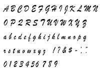
I dislike Brush Script
Brush Script typeface was created by Robert E. Smith in 1942. Appearance of Brush Script is handwriting letters with an ink brush.
In my opinion, I am not familiarise with handwriting letters. At first, I saw this typeface. I couldn't read it at the first time. I had to spent a few time to read it. After that, I could decide this typeface that can not be my typeface certainly.Let's mention about appearance. The characteristic Brush Script looks fat, ancient and lack of elegant. However, It may work on retro style. This is reason why I dislike Brush Script.


No comments:
Post a Comment