Critical Reflection On Design Project A
There are many briefs in the RSA student design award 2011/2012 such as, tomorrow’s workplace, shared assets, something for everyone, the good journey and ETC. Every brief is challenge for design student because it is difficult and complicated.It is very hard to design something that can answer the scope that the RSA set. Thus, I decided to work on the good journey’s brief because I think traveling become massive part of people’s life and I also concern in security of commuters. Furthermore, because I am one of traveller who always travel by underground train and bus. That is reasons why I worked on the good journey. After that, I read brief carefully. The aim of this brief is to improve daily journey and make people think differently about daily travel.
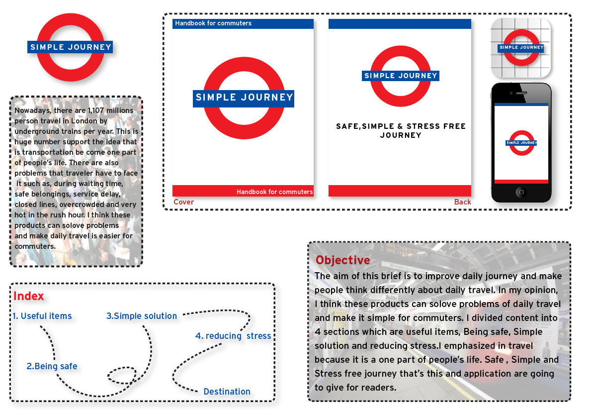
My process started with collecting research about transportation in London by using mind map to explore it. There are many kinds of transportation in London which are bus, overground train, underground train, cab and cycling. I decided to focus on underground train because I am also familiar with it. In the research method, I read details about tube from TFL website and 2010 annul report of TFL. Next step, I did two kinds of survey which are online survey and survey by myself. I did online survey to ask people that I know about when they travel by tube. For example, how often do you tube, how long do you have to wait on platform and which activity do you do on tube and second survey which is observation I noticed commuters behavior and interior design in tube. For example, what they do when they on platform and inside tube , how advertising and sign on tube look like After, I did two kind of survey. I got the idea about how to prevent waiting habits. At first, I did a scenario to show what is people have to face it when they travel by tube and bus. I thought I was going to push some entertainment on the tube which are television and radio. I took this idea to discuss with my tutors in class. Later, I got the new ideas which are handbook and smart phone’s application for commuters. It is called “simple journey”. Next step, I tried to list table content in handbook and details in application. The list of index which are essential equipment, how to reducing stress and how to project your belonging. Additionally, application present tube map service status short route and e-book.
Next stage is design process. After, I got the new idea. I sketched appearance of product. How are handbook and application going to be. At first, I created logo of product by using the same element of underground train logo but I changed word from “underground” to “simple journey”. I also used the same colour of underground identity. I brought my sketch to discuss with my tutors and classmate again. I received a new feedback. There were two feedback. Firstly, The idea was good. It could help commuters when they travel. Especially, short route in smart phone application. Secondly, I had to do more research about content in handbook. Honestly, I am not good in research because it is my first that I have to do a lot of research. However, I found out many substance which relate with my content and then I selected content to insert in handbook. In second step, I designed handbook similar with manual book. There were images and description for explanation. This book has four sections and I created different layout in each section and the images that I used which is vector image. Personally, I think vector images it is very strong graphic and also challenge designer to create something to make audiences understand. Furthermore, I design simple journey application content into four section which are Service Status, Tube map, Short Route and Simple Journey e-book. I did this sketch in digital form and present in the front of class. I got a new concept of my product which is “safe, simple and stress free journey” and also feedback from tutors and classmate. It was better than last time but I still had to develop it. This time, the problem is layout in handbook. It seem like indivisible and unusual. Afterwards, I bought layout book. I spent time for few days to read it in some section. In consequence, I can set symmetrical layout in my handbook. Moreover, I changed the logo of my product. because I used shape of underground train logo. Red circle and blue rectangle are signature of underground train London not my product. So, I decided to change simple journey logo. But I still use the same colour with underground train. Final of design step which is communication channel. My product relates with London underground train. Thus, the best place to promote my product. It should be tube station. I thought I would put handbook on information stall and set posters to present handbook in every place such as, the way to platform, platform, inside train and escalator. This is my design process in Design project A.
In conclusion, I am very satisfied with this product and idea because every step is done by myself. I though commuters can use this product practically because the content base on research and it can remind traveller what they are going to face. In my opinion, Handbook seems like reminder and smart phone application seems like alternative way for commuters. I hope this product can help people when they travel. Furthermore,this module is very effective for me due to the fact that I can improve my design skill planning skill and research skill.
References
Ambrose, G. and Harris, P., (2010) DESIGN THINKING UK:AVA Publishing SA.
Ambrose, G. and Harris, P., (2005) LAYOUT UK: AVA Publishing SA
London transport museum : guide (2007) UK : London transport museum
................................................................................................................................................................................................
British Transport Police, Don’t be a victim [online] Available from
http://www.wikihow.com/Survive-Taking-the-London-Underground
Personal Development Coach 20 tips to reduce stress [online] Available from
http://www.personal-development-coach.net/tips-to-reduce-stress.html
Lynn Eaton, Channel 4’s stress survival guide to travel [online] Available from
Direct Rail passenger safety [online] Available from
http://www.direct.gov.uk/en/TravelAndTransport/Publictransport/RailTravel/DG_10036272
TFL Design standards : London Underground [online] Available from
http://www.tfl.gov.uk/assets/downloads/corporate/lu-basic-elements-standard-issue02.pdf