Wednesday, 30 November 2011
Thursday, 17 November 2011
Review my blog (Design Research Method Task:4)
This is my first time that i use blog for present my work. I think it is effective and easier to communicate with audience. At first, I didn't know how to manage my blog and how to set template. I spent time around 1 hour to learn about it. At this moment, i know how to manage it and how to set layout. Let's talk about feature of my blog.Firstly, i used my favourite quote(keep running keep fighting) to be my blog title. Secondly, i divided my post in 2 section by date and curriculum. Thirdly,My layout is simple because i don't need to make look like functional blog. You just scroll up and down you read all of my post. Furthermore,when i wrote article i used Verdana typeface.Finally, the way that i use colour. I choose cool tone colour because when the colour combine with typeface i think it is easy to read. All of content in my blog is related with my assignment and inspiration.
Business for design : Mood board and develop logo
Hit the point is my company's name. Hit the point is creative agency. This is my company mood board. This mood board shows concept, vision and product of Hit the point. My company's visions which are creative , teamwork , accuracy , strategy and outstanding.In the middle of this board shows concepts of company which are "keep calm and carry on" this slogan makes my company through problems and continuance the work, "Think different" makes the company outstanding."Impossible is nothing" we believe whatever that we can think.It can be possible. "JUST DO IT" everything that come out we have to create it real."Make love not war" in creative industry, we won't make enemy, we will make friends.At the left corner That is our products. We can create info graphic and positive advertising. These products are main product of company.Main colour of Hit the point which are red , yellow , black and white. Furthermore, FUTURA is typeface of company. Hand hold dart that is symbolic of my company.
Here, This is logo development. I reduced colour from previous logo. I used 2 colour which are red and yellow. I reduced the circle of previous logo as well. I try to make it look simple but it's still in the same meaning.
Wednesday, 16 November 2011
Contract 2 organisations ( Design Research Methods Task3)
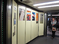
I tried to contract 2 organisations which are CBS outdoor and JCDecaux via e-mail.CBS outdoor and JCDecaux have their own product in Underground train London which are 96 sheets and 48 sheets of CBS outdoor, 4 sheets and digital 6 sheets of JCDecaux. At first, i explained myself and my objective after that I asked these organisations about their product. For example How many product do you have? , What kind of media do you have?, How do you approach your product to Underground Train London? and Do have a plan to develop commuters on platform?. At this moment, i'm still waiting for them rely me.
Tuesday, 15 November 2011
Symbolic of me
The object that i think is symbolic of mine which is a comic book. My favourite hobby is reading comic book. I think comic book is the good object that can represent myself. Comic book have a different chapters similar with me. I have different story in my life.Most of comic book are existing and don't know how is story going to end similar with me because i can not predict how is my life going to be. But i am sure one thing my life is going to be enjoyable life. There are various emotion in comic book which are comedy, drama and romantic relate my feeling. Furthermore, I use visual language to communicate with another like comic book. less of text but strong content. However, someone think comic is ridiculous and for children only but for me comic book is one kind of art. It is a powerful communication. This is why comic book is my symbolic.
Saturday, 12 November 2011
Postmodernism review (Design Research Methods task6)
Review
11/11/11
I went to V&A (Victoria and Albert Museum) to see postmodernism's exhibition.There were many interesting artwork in the exhibition. Most of works were created during 70's -90's.The collection of exhibition which are poster, architecture, product design, moving image, costume and music.
There are 3 artworks that i like specially.
First one, Concrete stereo was created by Ron Arad. The appearance, there are 4 pieces which are turntable , functional button and two of stereo. From my point of view when i saw this artwork. I feel stunned because it showed combination of music and structure.I interpreted the meaning of music and concrete. Music is the art of harmony and expression of emotion. Concrete is strong and stable. It also represents contemporary structure and future instrument in postmodern period.
Second one, TRUST ELVIS was designed by Paula Scher. The aim of this poster is to promote the US release of Elvis Costello's trust. She used Bold colour and Typeface to keep in mind about political advertisement. I like the way that she used the colour and composition of typeface. Furthermore, I also like the eyes of Elvis Costello look and the colour of the glasses. It made him look like innocent man.
Last one, This one is most of my favourite in this exhibition. This photo was taken by Jamie Morgan.The photo was cover of The Face magazine in March 1985. For me, I really feel impressed with this work.I think element of art in this photo is perfect. such as, light , emotion , composition , stylish and expression.When i saw this photo i feel like the kid focus on me and he's going to kill me.It is a powerful image. I like the artwork that interact with me.
Thursday, 3 November 2011
The good journey : Reserach
Firstly,I found some information about entertainment on Bus and Train that relate with my idea. I found out that it already have radio on the train but it is in process. TFL is considering about proposal. Highway agency is owner of this project. However, There is not television on the bus and train. Moreover, There is digital media in several station but that digital media present only advertising.
Source : http://www.tfl.gov.uk/businessandpartners/commercialopportunities/1267.aspx
Secondly, I found operational performance of TFL. From 2010 to 2011, there is 2,289 millions passengers who travel by buses and 1,107 millions person travel by underground trains. Furthermore, 80% of passenger who use buses and 79% of train passenger feel satisfied with TFL performance.
Source : Annul Report And Statement Account of Transport for London 2010/2011
The good journey : Scenario and Proposition (Design Research Methods task2)
The good journey
The aim of this brief is improvement of daily journey and make people think differently about daily travel. This scenario shows simple journey of people daily life and most of activities that people do which is waiting.
Simple journey
Name : Simple journey
Product : Hand book (A5 or A6)
Objective : To make simple journey for travelers
Style : Graphic Novel
Content : How to make a simple journey in daily travel, How to prevent waiting habit on tubes and platform, How to reduce stress on the rush hour, How to safe commuters property and what is essential tools for travel.
Target audience : All of commuters
Wednesday, 2 November 2011
Business for design
Hit the point
This is my company's logos. I designed in 4 different type of colour and stroke.
1
2
3
4
The most of my favourite logo is number 4. My inspiration come from dart board because the meaning of dart board is accuracy. In the same, accuracy is the meaning of my company's name as well.
How to design the logo?
Symbolic of my company is dart board. I used dart board shape in my logo and the way that i used colour it came from dart board colour. I reduce circle in the dart board to make it looks like a diagram. Furthermore, bullseye (dot in the middle of dart board) represent instead O alphabet in "Point".
What is this company and what the company do?
Hit the point is creative agency. We create artworks that base on research, statistic and fact. We can do graphic design and advertising. Our work is created by powerful idea and accurate information.
Aim of company.
We want to create artwork that is sincere and make people feel happy. That is the way this company communicate with the audience.
Slogan
" Accuracy is our way"
Tuesday, 1 November 2011
Subscribe to:
Comments (Atom)


